January colors and the High Line’s “Four Arches”

Faded grasses, gray skies, a myriad shades of bare branches. The colors of January are, for the most part, soft and muted. Such colors lined the walkway of New York City’s High Line, an elevated park built on an old train line, on a recent early morning walk.

I was struck by how the earthy colors of the leaves and branches blended with the brick of different buildings.

Other times bursts of color stood out, as with the red berries against a bare wall,

the coppery branches set among the evergreens, and a few splashes of yellow.

An unexpected pleasure was coming across one of the “En Plein Air” art installations that enliven the Highline — “Four Arches” by artist Sam Falls.

post15

A simple walk through the four slender arches provides a subtle thrill, perhaps coming from the delicacy of plant life depicted on the arches. The colors of the painted leaves and flowers blended with the muted quiet of the day. Understated and elegant, the arches seem perfectly situated for the High Line.

The plaque next to the installation explains why the design so resonates with its surroundings. Falls created “four ceramic archways supported by the steel tracks from the High Line’s original railway, each of which is dedicated to a different season in the park. For one year, Falls collected plants from the High Line, embedded them in ceramic, and fossilized them with colorful pigments.” 

post13

The linearity of the gray steel rails and the painted plant life complement each other in an unexpected way. The artwork is a collection of oppositions: the rails are durable, rigidly straight, industrial and functional; the depictions of plant life are delicate, airy, colorful, organic in shape, and decorative. The nearly hundred-year-old rails contrast with the seasonal ephemeral plants. 

The installation is so slender and unobtrusive that you could easily miss its intricacies, especially when the High Line becomes crowded at midday, or if you are engaged in conversation or taking in the views of the city. From a distance “Four Arches” is one thing — an angular walkway set among the other angles of the surrounding buildings.

posthl27

Close up, it becomes a seasonal garden of gorgeous colors and shapes,

full of individual compositions which must have involved countless decisions for the artist: How to present such variety? How best to portray the delicate flowers, leaves, and grasses? Which plants should be placed at eye level, and which will work on the top horizontal beams? How to represent the seasons? Which colors work best together?

“Four Arches” is a welcome garden on a gray January morning.


Happy New Year!

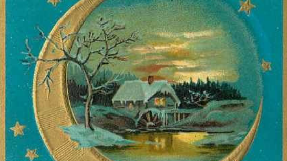
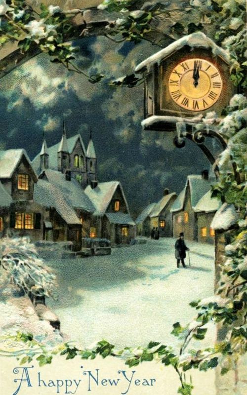
In the Christmastime series, Lillian collects Victorian cards and displays them on her mantel for the holidays. Below are a few cards that might have been part of her collection, along with a few Victorian sentiments ushering in the New Year.

card crop

“Ring out the old, ring in the new, Ring, happy bells, across the snow…”
― Alfred Tennyson

NYsnow


“Only a night from old to new! Only a night, and so much wrought!” ―Helen Hunt Jackson

NY2


“So may the New Year be a happy one to you, happy to many more whose happiness depends on you!” ― Charles Dickens

NY9

NY5

HAPPY NEW YEAR!

NY1


The Making of a Book Cover — Christmastime 1939: Prequel to the Christmastime Series

I was lucky to find a great book cover designer, Laura Duffy, for all my books. The Christmastime series, in particular, required several drafts.

Laura patiently added snow, made streetlights glow, erased modern buildings, and cropped and colored and added details until I had the image I wanted.

The cover for Christmastime 1939: Prequel to the Christmastime Series posed the most challenges. Early on, we decided that it would have a few subtle differences. As a prequel, it would not be part of the color sequence of the other books — green, red, blue. And Laura suggested that the “photograph” be vertical rather than horizontal.

I wanted the cover to evoke a sense of happiness and hope, with just a hint of the shadow cast by the war in Europe. After searching and searching for a photograph that would capture the main character’s (Lillian Hapsey) longing to move to Manhattan and start life anew, I found an image that might possibly work — with a little magic from Laura Duffy.

The photo had certain elements I was looking for: snow, a source of light (a lamppost), and it was immediately recognizable as Manhattan, with the Empire State Building in the center of the photo.

shutterstock_548493256

But it needed some work.

First, the lamplights needed to be “turned on.” It took a few attempts to get the right shade of soft gold. Then we looked at several Christmas wreaths, pine boughs, and red ribbons to attach to the lamppost. We decided on the one below. I purchased the photo and Laura added and aged it.

Next, the Empire State Building needed to be more pronounced. The original photo depicted a foggy day (I wanted snow), and the outline of the building was obscured.  So Laura found and superimposed a clearer photo of the Empire State Building and added a light snowfall.

Empire State Bldg superimposed

We were getting closer, but it didn’t yet capture the charm and promise of new beginnings. I imagined a scene at dusk, people hurrying home after work, the Christmas season in the air — and Lillian pausing to look at the view of the Empire State Building and having a visceral feeling of connection — Manhattan embodied everything she wanted.

So Laura turned day into evening, showing lights in the office windows, and patiently adjusting my requests for “less blue, a little grayer, more dusk-like, a little darker, more snow?” — until finally, it clicked — and I entered the world of Christmastime.

The image captures a moment in the story when Lillian becomes a part of the city she so loves. I could see her dressed in 1930’s shoes and coat, her face raised in happiness, knowing that her two little boys would also love the magic of the city. I felt the image now had charm, a sense of excitement, and the feel of Christmas.

1939

Thank you, Laura!

Check out the variety of Laura’s covers here: https://www.lauraduffydesign.com/ 

Christmastime 1939 is now available (the softcover will be available any day now).

(The final book in the series, Christmastime 1945: A Love Story,  will be published in 2019.)


Summer Yellow

Yellow 7

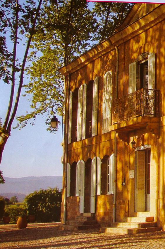
Though there are many colors of summer, yellow — bright and cheerful — stands out as the emblematic color of the warmer months. Perhaps because it’s the color of the sun and sunflowers, dandelions and lemonade, and other associations with hot summer days.

lemon arbor

“Indicating sunshine during the Renaissance to being one of the primary colours of Cubist art, yellow finds an intrinsic place in literature, allegory and symbolism.

Representing light, hope, happiness, and wisdom, yellow is meant to evoke optimism or natural light with an airy, radiant atmosphere.   ” — http://www.architecturaldigest.com

Yellow 29

“How wonderful yellow is. It stands for the sun.” — Vincent Van Gogh

Yellow 3

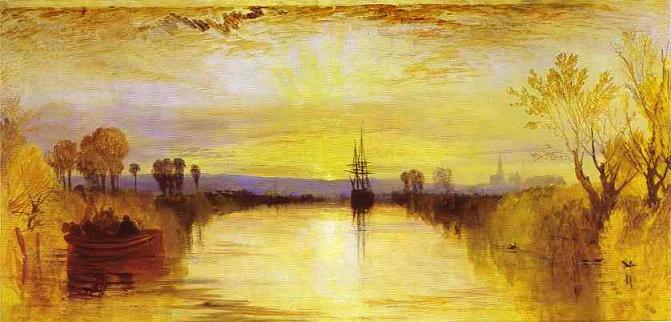
“Few artists in history have been known for their use of yellow,  though J.M.W. Turner and Vincent Van Gogh are the most notable exceptions” — most famously, Van Gogh’s depictions of the sunflowers and fields of Arles, and Turner’s “sublime and sun-lit seascapes.” http://www.artsy.net

Yellow 4

Yellow 5

“We find from experience that yellow excites a warm and agreeable impression….The eye is gladdened, the heart expanded and cheered, a glow seems at once to breathe toward us.” — Johann Wolfgang Von Goethe

Yellow 22

“The yellow glistens.
It glistens with various yellows,
Citrons, oranges and greens
Flowering over the skin.” — Wallace Stevens

Yellow 27

“The road to the City of Emeralds is paved with yellow brick.” –L. Frank Baum

Yellow 25