
I was lucky to find a great book cover designer, Laura Duffy, for all my books. The Christmastime series, in particular, required several drafts.


Laura patiently added snow, made streetlights glow, erased modern buildings, and cropped and colored and added details until I had the image I wanted.


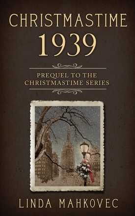
The cover for Christmastime 1939: Prequel to the Christmastime Series posed the most challenges. Early on, we decided that it would have a few subtle differences. As a prequel, it would not be part of the color sequence of the other books — green, red, blue. And Laura suggested that the “photograph” be vertical rather than horizontal.
I wanted the cover to evoke a sense of happiness and hope, with just a hint of the shadow cast by the war in Europe. After searching and searching for a photograph that would capture the main character’s (Lillian Hapsey) longing to move to Manhattan and start life anew, I found an image that might possibly work — with a little magic from Laura Duffy.
The photo had certain elements I was looking for: snow, a source of light (a lamppost), and it was immediately recognizable as Manhattan, with the Empire State Building in the center of the photo.

But it needed some work.
First, the lamplights needed to be “turned on.” It took a few attempts to get the right shade of soft gold. Then we looked at several Christmas wreaths, pine boughs, and red ribbons to attach to the lamppost. We decided on the one below. I purchased the photo and Laura added and aged it.


Next, the Empire State Building needed to be more pronounced. The original photo depicted a foggy day (I wanted snow), and the outline of the building was obscured. So Laura found and superimposed a clearer photo of the Empire State Building and added a light snowfall.

We were getting closer, but it didn’t yet capture the charm and promise of new beginnings. I imagined a scene at dusk, people hurrying home after work, the Christmas season in the air — and Lillian pausing to look at the view of the Empire State Building and having a visceral feeling of connection — Manhattan embodied everything she wanted.
So Laura turned day into evening, showing lights in the office windows, and patiently adjusting my requests for “less blue, a little grayer, more dusk-like, a little darker, more snow?” — until finally, it clicked — and I entered the world of Christmastime.
The image captures a moment in the story when Lillian becomes a part of the city she so loves. I could see her dressed in 1930’s shoes and coat, her face raised in happiness, knowing that her two little boys would also love the magic of the city. I felt the image now had charm, a sense of excitement, and the feel of Christmas.
Thank you, Laura!
Check out the variety of Laura’s covers here: https://www.lauraduffydesign.com/
Christmastime 1939 is now available (the softcover will be available any day now).
(The final book in the series, Christmastime 1945: A Love Story, will be published in 2019.)

Linda, YOU have a marvelous eye for beauty. This new cover is magnificent.
LikeLike
Hi Donna – I’m so glad you like it. I really appreciate your feedback!
LikeLike
Wowie wowie wow!! It’s a masterpiece!
LikeLike
Thanks, Esther!
LikeLike
Oh Linda! The cover of Christmastime 1939 is just Beautiful!! What a BEAUTIFUL Christmas card it would make!! I LOVE it and would buy it in Christmas Card form in a heartbeat!! Of course, the book is on it’s way to my house as i type this…i ordered it as soon as i saw it earlier today on eBay! I can hardly wait to start reading it!!
LikeLike
Hi Kathie –
I’ll have to think about making Christmas cards – that’s a great idea!
Enjoy the book!
Linda
LikeLike
Hi Linda
If you need someone to read and reviewan arc of the book I would be happy to do that.
Thank you,
Donna Burfield
> WordPress.com
LikeLiked by 1 person
Hi Donna – Thank you so much for the offer. I’ll definitely put you on my arc list for my next book. I would love to have you as a reader. I’m working on the final book in the series – Christmastime 1945 – and will reach out to you for that book.
Thanks again.
Linda
LikeLike
Can’t wait to get a copy of this newest book. You know I loved the others!
LikeLike
Thank you, Lisa!
LikeLike